Posts

Showing posts from November, 2017
Image
Contrast I personally think the contrast between the green and the white went very well, the green was a darker emerald-ish green and the white is a pretty good opposite to the green. The dark-gray on the yellow-gold didn't turn out too well, I could've gone with something a bit brighter but it fit the color scheme of the characters. Alignment In this piece I used a mix of right and left align and a couple times I used center alignment but most of the time I used left of right, for the visit link and the email I used right align that way they look clean and hug the wall. The title "The Wizard of Oz" was mixed and used several alignments and sizes to show importance per word. Repetition  The repetition for this piece was generally the same, white on green and dark gray on yellow gold. I think repetition for the theme was relatively smooth.  Proximity I made different sized text to show importance in text, for example the title is the largest i
Image
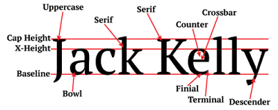
This project was about Typography and all the different types of typography, when I look at a graphic design that involves text it brings a whole new thought train and changes what I think. .I learned some new hotkeys and tricks in adobe illustrator in the process of making this graphic. The Project went very smooth, It went by very quickly and I think the final product was good.

Logo Color Scheme

Image
Logo Color Scheme Analogous This logo uses the analogous colors of orange, red, and yellow. I think the company probably chose these colors because it grabs attention very well. This logo uses the analogous colors of blue, green, and yellow. I think the company probably chose these colors because it contains cool relaxing colors. Complementary This logo uses the complementary colors of purple, and gold. I think the company probably chose these colors because it gives the royal vibe. This logo uses the complementary colors of blue, and orange. I think the company probably chose these colors because its cool and warm and the colors go good together. Warm This logo uses the warm colors of red, and yellow. I think the company probably chose these colors because its warm and exiting like the drink. This logo uses the warm colors of blue, yellow, and red. I think the company probably chose these colors because the sun in th