Posts

Showing posts from December, 2017

Q2 Web Project

Image
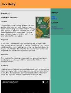
I personally think this was my favorite project that we've completed so far, I love html and using DreamWeaver made the process of making a site so much, previous to this project I made a couple basic site in Notepad++ which was very difficult/inefficient. I learned a lot about how sidebars, footers, and headers work. I personally really liked the software, it was very nice to click a button and add in code so quick, and aligning/floats were really easy. This page was my project page showcasing all of my previous work in the program. It contains my "Wizard Of Oz Play" project and the "Point A to B" project. I hadn't done much photo alignment or much with pictures, so I learned some new skills in the process of making this webpage, I used the "Segoe, Segoe UI" font family and I just really liked the overall look of the font. The color scheme was inspired by a color scheme I've liked for awhile, I personally think Cyan, Orange, and White

Elevator Pitch

Hello, my name is Jack Kelly, I specialize in Cyber Security and Web Design. I know a good amount of HTML and I am learning C++ as of now. I find Cyber Security, Photoshop, Video Editing, Web Design, and Crypto Currency all very interesting. I consider myself an entrepreneur. I consider myself an outgoing, intelligent, and haste person. I also consider myself very good at working several OS’s. I am learning a lot about routers and switches as of now. I have great communication skills and have good working habits. If you have a position available for me please email kcjackkelly@gmail.com, thanks for your time.
Image
Process: I started off with a couple ideas in mind with jagged edges for a J, and those failed to make me feel good about them. Then I tired making a background shape and fitting a J inside of it, that didn't work well because I tried o fill the blank space in the top and also tried to add 2 sides the the top of the J. I tried several J designs and shapes, but nothing seemed to work so I decided that the only option was to use text for the J. My Thought Process: I tried to incorporate white, cyan, and orange into the logo, but the intricate/unique shape that I created was nearly impossible to fill with color with my current skill set with adobe illustrator. I also attempted to fill the top triangle with with several different color gradients but was too difficult with the small amount of time I had left. I am not very satisfied with the final product at all but the shape at least looks decent in my opinion. I just need to re-evaluate how to incorporate the